February 12, 2015 •David Kretch
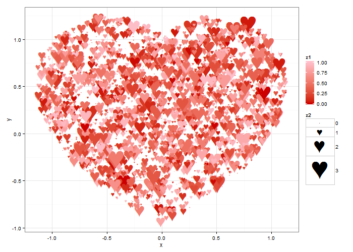
Love, true love, is why we’re here today. This is how the people at Summit show our love – with statistical graphs. This heart scatterplot was made in R using the ggplot2 and animation packages:

To make the heart, we first take a mathematical formula for a heart curve, (x^2 + y^2 - 1)^3 - x^2 y^3 = 0, and trace the curve by numerically finding its solutions. We do this in R by iterating over x, and at each x, finding the roots of the remaining formula in y after evaluating the heart curve formula at x. For example, at x = 0, we then find the roots of (y^2 – 1)^3 = 0, which are -1 and 1. Once we’ve done this, we have the outline of our heart.
We want to show a full heart, so now that we have the outline of the heart, we want to fill it in. To do this, we generate many random points, and test whether they’re inside the heart. If so, we keep them. This is akin to rejection sampling and Monte Carlo integration, which allow you to generate samples from complicated probability distributions or shapes. The points that we keep are our heart. So not only can these techniques be used for war, they can be used for love as well.
After we have our full heart, we plot it using ggplot, and use the animation package to put together each individual graph into a single animation.

The code for this is available here, in an R file. Let us know if you use it for anything cool!