
May 13, 2015 •Kelley MacEwen
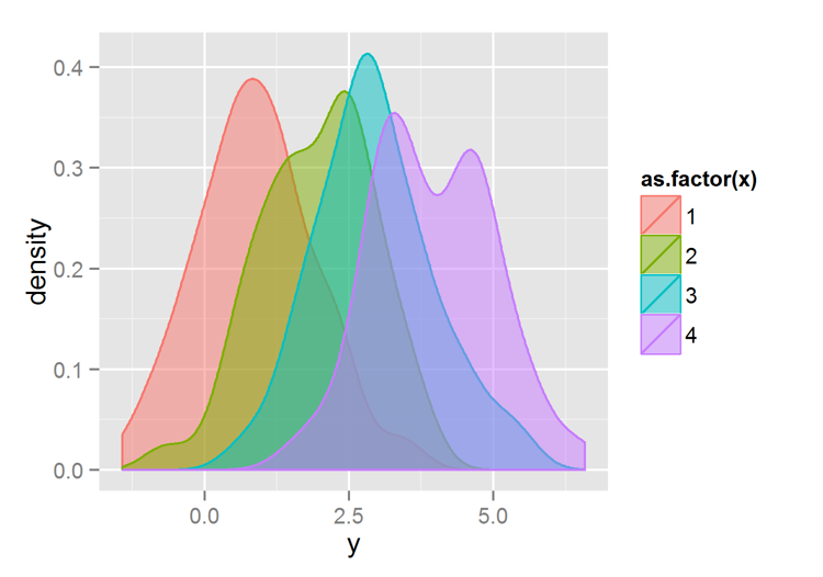
 Earlier this year, we posted a fun example of using statistical graphs to create a valentine for your data-loving sweetheart. While it was a nice way to celebrate the holiday, we at Summit know that good data visualization is important every day of the year. Sometimes, the results of our analyses are most useful when we're able to show a picture of how data change over time or how it may be influenced by different factors. The author of that Valentine's Day blog post, David Kretch, recently shared some best practices for data visualization as part of PEAKS. His presentation, embedded below, shows just how useful graphs and plots can be when analysts pay attention to details while keeping it simple.