
August 5, 2015 •Melissa Cichantek
For sports fans, this is a great time to be alive. We’re entering an age where data analytics is revolutionizing the way we see sports. A perfect example is basketball, where the NBA now collects spatial data on player and shot locations on the court. This data can be used to create shot charts, which show where shots are taken and how successfully. A single shot chart can tell a story about a player’s shooting tendencies, strengths, and weaknesses.
I was inspired by the work of Kirk Goldsberry to learn how to make shot charts and look at shooting efficiency from a new perspective. Imagine a map overlaying a basketball court that tells us the underlying probability of scoring a shot from any given location. Though this map is not directly observable, it can be inferred using a large sample of shots. I collected data for the location of every shot in the 2014-15 NBA season for my sample. I used Python code found on GitHub to gather the NBA data. The figures below show the percentage of shots made (field goal percentage) within each tile before and after smoothing. The raw map represents the observed field goal percentage within each tile, whereas the smoothed map shows the expected field goal percentage.
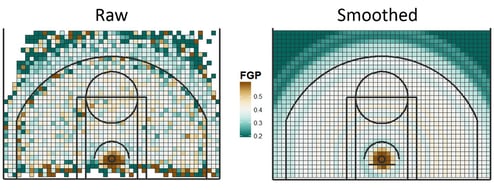
In order to smooth the field goal rates, I first transformed the space of the basketball court into polar coordinates as I assumed that the probability of making a shot was a function of the shot’s distance from the basket and the angle of the shot. Then, I used a generalized additive model, which allowed me to estimate probabilities from each point as a smooth nonlinear function of the angle and distance from the basket.
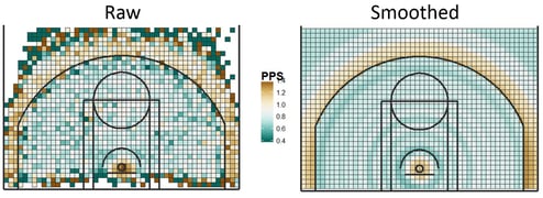
The points per shot maps show the observed points per shot versus the expected points per shot from each tile. Using the expected points per shot of each location on the court, we can then evaluate a player’s shooting efficiency. Every player has a distinct constellation of shots, showing where they took their shots from. We can evaluate a player’s shooting efficiency by comparing the number of points they actually scored to the number of points an average player would be expected to score given the player of interest’s unique constellation of shots. From this, I derive a metric called Points Over Expected (POE), which measures how many points a player scores above what they are expected to score, based on the shots that they take. A positive POE means that a player is shooting efficiently, and a negative POE means that a player is shooting at a rate below the NBA expected rate.
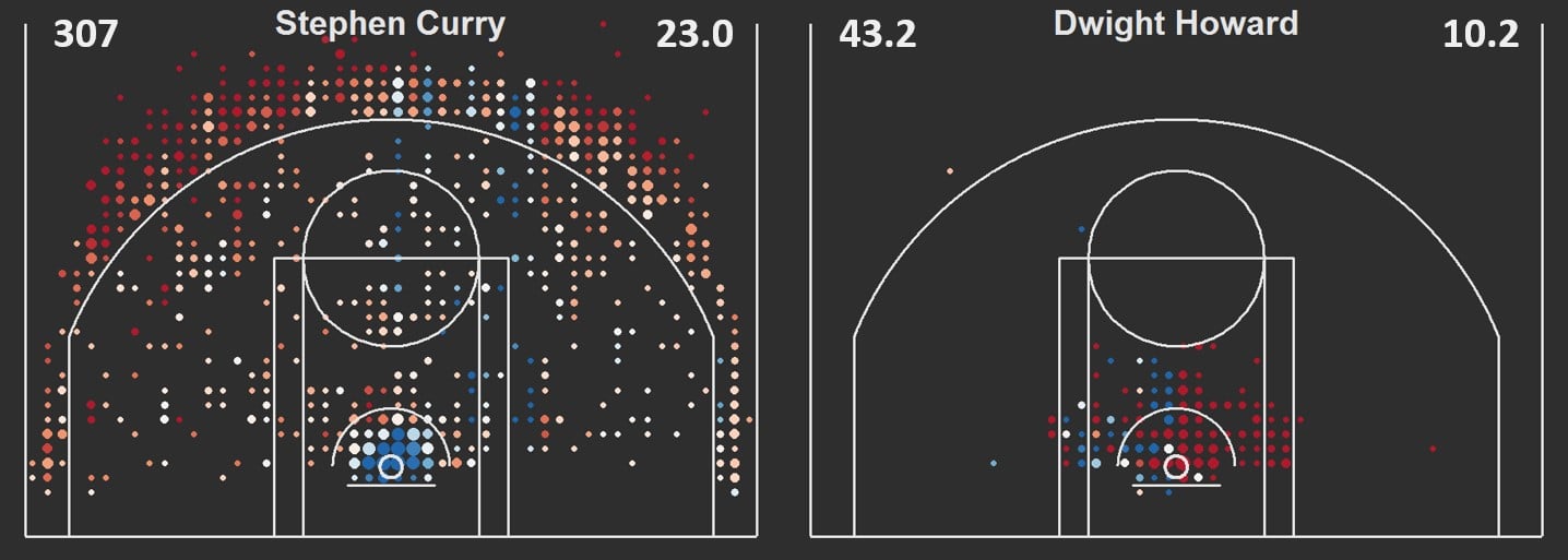
Figure 3 (below) shows the shot constellations of Steph Curry (blue) and Dwight Howard (red), two players who take very different types of shots.
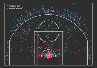
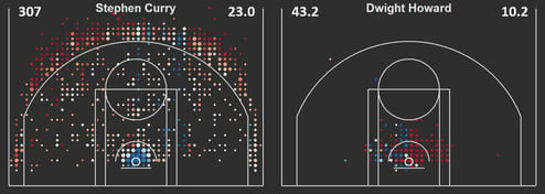
Figure 4 (above) shows the spatial shooting efficiency shot charts of Stephen Curry and Dwight Howard. Red indicates a higher shooting efficiency and blue indicates a lower efficiency. The number in the top left of each chart is the POE over the course of the season and the number in the top right is the POE per 100 shots taken.
Over the course of the 2014-15 season, Curry scored 307 points more than you would expect an average NBA player to score, given his constellation of shots. Let’s put it this way: it’s no mistake that he’s the MVP.